Wycombe Wanderers, a new home kit and the wrong kind of sun
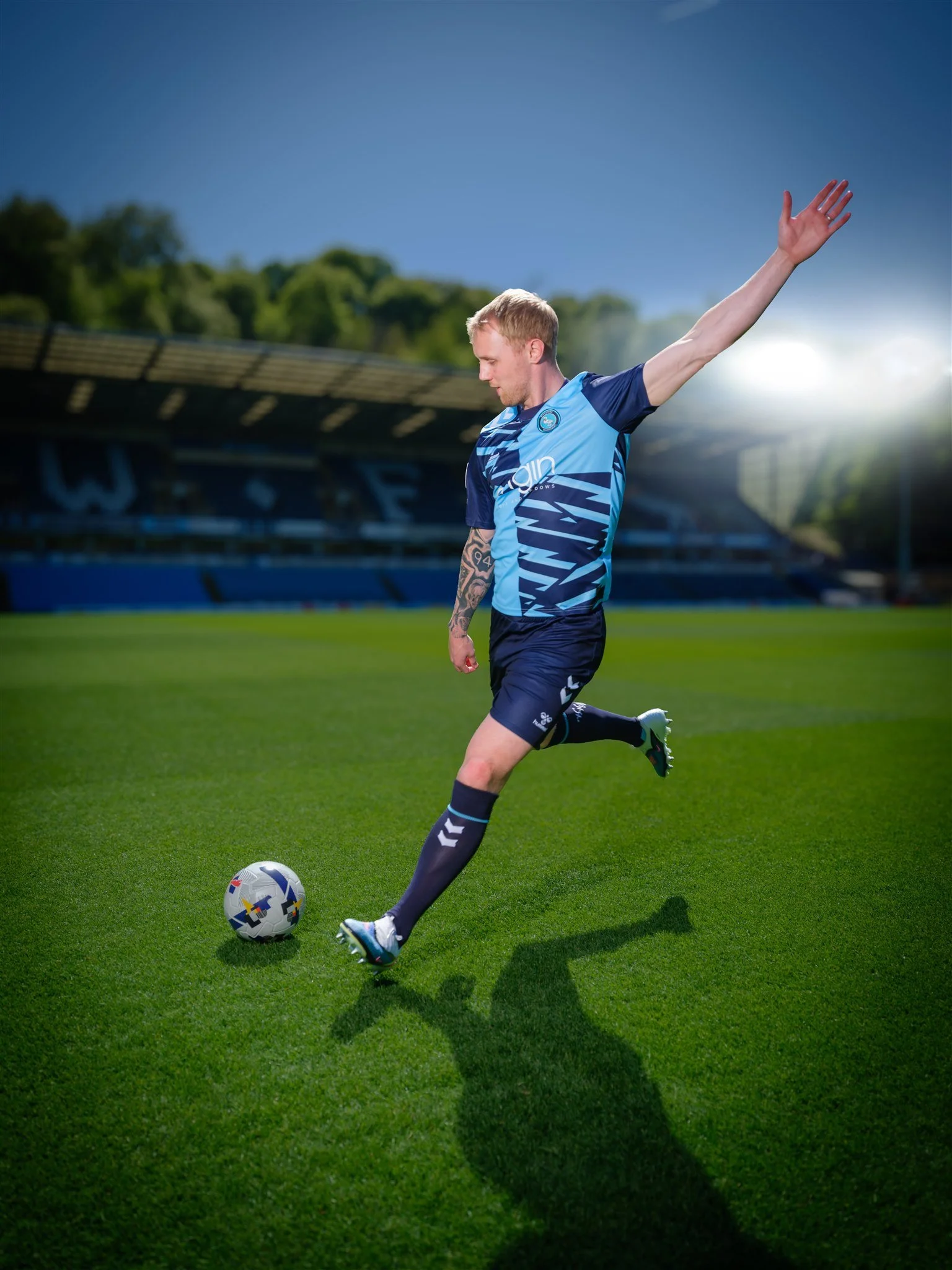
HWLife Magazine wanted images for the launch of the new Wycombe Wanderers home shirt, and the only window we had was the middle of a bright, cloudless day. No reschedule, no Plan B ‚just the sun directly overhead and a pitch full of hard shadows.
It isn't the light any photographer would choose. Noon sunlight tends to flatten the face, harden the eye sockets, and drop a sharp black line under everything that stands on the grass. Beautiful for a documentary frame; less helpful when the brief is a clean, crafted portrait of a footballer mid-strike, in a kit that needs to read clearly.
So the job became two jobs. One: keep the kit looking like the kit ‚ the tonal banding across the chest, the lighter blue against the darker, the way the socks finish the silhouette. Two: keep the picture looking like one of mine.
The answer was less about adding light and more about deciding which light to fight. We worked into the sun rather than away from it, used the stand as a soft reflector, and lifted the shadow under the brow with just enough fill to keep the face honest without flattening it. What came back is a frame that holds together: a player who looks like himself, a kit that looks like the kit, and a picture that sits comfortably alongside the rest of my work. The stadium lights were added in Photoshop and I rather like this version.
There's a quieter point in this, too. Most of what I do is editorial portraiture ‚ people in rooms, on stages, behind desks. A sports commission has a different rhythm, but the underlying job is the same: make the subject feel at home in front of the camera, work quickly, and come away with something the client recognises immediately as right.
The new shirt looks good on the pitch. Wycombe's colours usually do.